Choosing the right Christmas color scheme isn’t just about throwing up whatever decorations happen to be on sale. It sets the mood for your entire holiday season, affects how cohesive your home feels, and determines whether your efforts look intentional or haphazard. A well-planned palette makes decorating easier, too, you’ll know exactly what you’re shopping for instead of wandering the seasonal aisle grabbing random ornaments. Whether you’re aiming for classic tradition, modern elegance, or something totally unexpected, committing to a color story will elevate your holiday decor from random to refined.
Table of Contents
ToggleKey Takeaways
- A well-planned Christmas color scheme creates visual continuity throughout your home and simplifies purchasing decisions by eliminating random decorating choices.
- Traditional red and green remains the most recognizable palette, but success depends on balancing saturation, choosing supporting neutrals, and layering textures to avoid a dated look.
- Navy and gold delivers sophisticated modern Christmas style that works in contemporary spaces, small homes, and transitions beautifully into New Year’s decor for extended use.
- Texture is essential across all Christmas color schemes—mixing materials like velvet, matte finishes, metallics, and natural elements prevents any palette from looking flat or unfinished.
- Lighting temperature matters: warm whites (2700-3000K) suit rustic and traditional schemes, while cool whites (5000-6500K) enhance winter whites and silvers for the intended effect.
- A cohesive Christmas color scheme reflects your home’s existing style and personal taste while creating intentional, impactful decor rather than random seasonal purchases.
Why Your Christmas Color Scheme Matters More Than You Think
A defined color scheme creates visual continuity throughout your home. Instead of each room feeling like a separate holiday project, a consistent palette ties everything together, from your front door wreath to your mantel garland to your tree ornaments.
It also simplifies purchasing decisions. When you know you’re working with navy and gold, you won’t waste money on that adorable mint-green stocking that doesn’t match anything else. Your decorations become reusable investments rather than one-season impulse buys.
Color choice affects mood and perceived temperature. Warm palettes (reds, golds, oranges) make spaces feel cozy and intimate. Cool tones (blues, silvers, whites) create a calm, spacious feel. If your home runs dark or small, lighter schemes can open things up. If you’ve got high ceilings and big windows, deeper colors add warmth.
Consistency doesn’t mean monotony. A scheme gives you a framework to work within, you can still layer textures, vary intensities, and mix matte with metallic. The difference is intentionality. You’re making choices based on a plan, not just filling a cart.
Traditional Red and Green: Timeless Holiday Elegance
Red and green remain the most recognizable Christmas palette for good reason, it’s rooted in centuries of symbolism and works in nearly any home style. The key is balancing the saturation and choosing the right supporting neutrals.
Deep forest green paired with burgundy or cranberry red skews traditional and formal. This works beautifully in homes with wood trim, built-in shelving, or classic architecture. Add touches of gold for warmth, or cream to soften the intensity.
Bright emerald and cherry red bring energy and nostalgia, think vintage ornaments and candy canes. This version works well in more casual or eclectic spaces. Use white as your neutral to keep it from feeling too heavy.
Avoid the mistake of going 50/50 on red and green. Pick a dominant color (usually green for larger elements like garland and wreaths) and use the other as an accent (red bows, berries, ribbons). If your sofa or walls are already bold, let those be your anchor and layer decorations accordingly.
Texture matters here. Velvet ribbon, matte ornaments, natural pine, and metallic accents keep a traditional scheme from looking flat or dated. According to Better Homes & Gardens, layering textures creates depth even within a limited color palette.
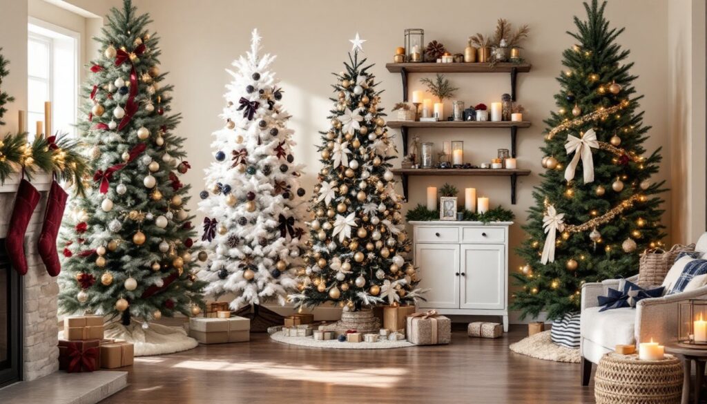
Winter Whites and Silvers: Creating a Frosty Wonderland
An all-white or white-and-silver palette transforms your home into a serene, elegant winter retreat. It’s especially effective in modern or minimalist spaces, but can work in traditional homes if you add enough texture to avoid a sterile feel.
Start with white or flocked trees. Flocking kits are available at most hardware stores if you’re working with an existing green tree, just note that the process is messy and best done outdoors or in a garage. Let the tree dry fully (24-48 hours) before decorating.
Layer silver, mercury glass, crystal, and frosted glass ornaments for reflective variation. Add white or ivory ribbon, faux fur tree skirts, and LED string lights in cool white (5000-6500K color temperature) to emphasize the icy effect.
Don’t skip texture. This scheme lives or dies on it. Mix smooth glass balls with glittered picks, chunky knit stockings, and natural elements like white birch branches or bleached pinecones. Without texture, white-on-white looks unfinished.
This palette shows every speck of dust, so plan for more frequent touch-ups. It’s also less forgiving with pets and kids, consider your household traffic before committing. If pure white feels too stark, warm it up with touches of champagne gold or soft blush pink.
Navy Blue and Gold: Sophisticated Modern Christmas Style
Navy and gold deliver a refined, grown-up Christmas that feels special without being overly traditional. It’s an excellent choice for contemporary homes, small spaces, or anyone tired of the standard holiday palette.
Use navy as your dominant color, navy garland, navy velvet ribbon, or a navy tree skirt. Pair it with brushed gold or antique brass ornaments for warmth. Avoid shiny gold: it can veer too glitzy. Matte or brushed metallics feel more sophisticated.
Add crisp white as your third neutral. White lights, white candles, or white floral picks keep the scheme from feeling too dark. If you want a fourth accent, blush pink or ivory work well without disrupting the palette.
This scheme works especially well on artificial trees in darker greens or even navy itself. Several manufacturers now offer non-traditional tree colors, just make sure the base is sturdy enough to support ornament weight (check for trees rated at 7-10 lbs per foot of height for heavier glass ornaments).
Navy and gold transitions beautifully into New Year’s decor, so you can leave it up longer without it feeling stale. Swap out a few Christmas-specific items (like Santa figures) for generic winter elements, and you’ve got decor that works through January.
Rustic Neutrals and Natural Tones: Cozy Farmhouse Christmas
Rustic neutrals bring warmth and texture without bright colors. Think cream, beige, tan, burlap, natural wood, and soft greens. This palette suits farmhouse, cottage, or cabin-style homes and pairs perfectly with real greenery.
Focus on natural materials: wood bead garland, jute ribbon, linen stockings, dried orange slices, cinnamon sticks, and pinecones. Real pine or fir garland brings in organic green without feeling bright or artificial. If you’re using artificial greenery, choose realistic styles with varied needle texture, cheap plastic garland kills this look.
Buffalo check (usually black and white or black and cream) is a farmhouse staple that works as an accent here. Use it for ribbon, tree skirts, or wrapped packages, but don’t overdo it, it’s become trendy to the point of cliché.
Lighting is critical. Warm white LEDs (2700-3000K) are a must. Cool white or multicolor lights clash with the earthy palette. Battery-operated string lights in glass jars or lanterns add ambiance without cords.
Many interior designers featured on HGTV recommend incorporating natural wood elements as a grounding feature. Consider wooden ornaments, slices of birch log as risers, or a simple wood ladder as a display for stockings and greenery. Keep metals to a minimum, if you use any, stick to matte black or oil-rubbed bronze for hooks and hardware.
Bold and Bright: Jewel Tones for Maximum Impact
If you want drama, jewel tones deliver. Emerald green, sapphire blue, amethyst purple, ruby red, and gold create a luxurious, saturated palette that works beautifully in homes with high ceilings, strong natural light, or bold existing decor.
This isn’t a scheme for the faint-hearted. It requires commitment and a good eye for balance. Use one or two jewel tones as primaries and the rest as accents. For example, emerald and sapphire as your base, with touches of plum and gold.
Velvet, satin, and metallic finishes are your friends here. Glossy ornaments reflect light and intensify color. Pair them with gold or brass metallic accents, silver tends to cool the palette down too much.
Jewel tones look best with strong contrast. If your walls are light, these colors will pop. If your walls are already bold, make sure your chosen jewels either complement or intentionally clash in a designed way. This scheme doesn’t do subtle.
Lighting needs to be warm and generous. Jewel tones absorb light, so you’ll need more than usual to avoid a cave-like effect. Layer string lights, candles, and spotlights. Experts at Martha Stewart often suggest using uplighting behind the tree to create depth and prevent dark corners.
This palette is high-maintenance. Dust shows on dark, glossy surfaces, and the richness can feel overwhelming in small spaces. It’s ideal for formal living rooms, dining rooms, or entryways where you want to make a statement.
Conclusion
A cohesive Christmas color scheme isn’t about restriction, it’s about intention. Whether you lean traditional, modern, rustic, or bold, committing to a palette makes decorating easier, more impactful, and frankly, more enjoyable. Choose colors that reflect your home’s existing style, your personal taste, and the mood you want to create. Then layer textures, vary intensities, and don’t be afraid to edit as you go.