Picking a color scheme for a Christmas tree isn’t just about slapping on ornaments. It’s the framework that holds everything together, the difference between a cohesive, designer-level display and a chaotic pile of decorations. A deliberate palette controls visual weight, directs the eye, and sets the emotional tone for the entire room. Whether someone’s working with a six-foot artificial tree or a nine-foot noble fir, the color decisions made upfront determine how every ribbon, bulb, and pick will read once it’s all assembled. This guide breaks down twelve proven combinations, from traditional red-and-green to modern jewel tones, with practical tips for executing each one without second-guessing halfway through.
Table of Contents
ToggleKey Takeaways
- A deliberate Christmas tree color scheme controls visual weight and creates designer-level cohesion instead of a chaotic mix of decorations.
- Limiting your palette to two to four colors maximum allows individual ornaments to shine while maintaining focus and preventing the tree from looking cluttered.
- Choose color schemes that complement your room’s existing paint, fabrics, and lighting—cool-toned trees suit cool LED lights while warm schemes glow under incandescent bulbs.
- Classic combinations like red and green or gold and cream remain timeless, while trendy schemes may feel dated within a few seasons, so consider longevity when budgeting.
- Execute your chosen palette by starting with lights first, layering ribbon vertically for movement, varying ornament sizes and finishes, and stepping back frequently to check balance.
Why Your Color Scheme Sets the Tone for Holiday Decorating
Color does more than look pretty. It establishes rhythm, balance, and focus. A well-chosen scheme creates visual hierarchy, guiding the eye from top to bottom and front to back. Without a plan, ornaments compete for attention, and the tree reads as cluttered instead of curated.
Consider how retail displays and professional installations always stick to a limited palette, usually two to four colors max. That restraint isn’t arbitrary. It lets individual elements shine while maintaining cohesion. The same principle applies at home. A color scheme acts like a filter: it tells someone what to buy, what to skip, and where to place each piece.
It also ties the tree into the surrounding space. If the living room leans neutral with gray upholstery and white trim, a tree loaded with jewel tones might clash. But a silver-and-white scheme picks up those cool tones and amplifies them. Decorating without a scheme is like framing a house without a blueprint, possible, but inefficient and prone to expensive do-overs.
Classic Christmas Tree Color Combinations That Never Go Out of Style
Red and Green
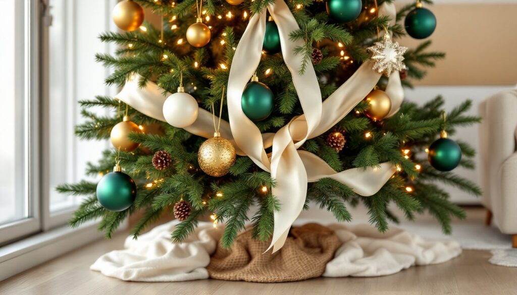
The original. This pairing works because of its high contrast and cultural shorthand for Christmas. Use forest green or emerald as the base, darker greens anchor the palette, and layer in crimson, burgundy, or fire-engine red ornaments. Add touches of gold or brass to warm it up and prevent it from skewing too primary.
Materials: Velvet ribbon, glass ball ornaments in matte and gloss finishes, natural pinecones sprayed gold.
Red, Gold, and Cream
This softens traditional red by swapping green for neutral cream or ivory. It reads warmer and more elegant, especially under incandescent or warm LED string lights. Use brushed gold accents (not shiny foil, it cheapens fast) and cream satin ribbons. Incorporate wooden bead garland or dried orange slices for texture.
Silver and Blue
Cool-toned and wintry. Pair cobalt or sapphire blue ornaments with brushed silver, mercury glass, and icy white. This combination reflects light beautifully and works well with white or flocked trees. Add clear glass icicles and white feather picks to emphasize the winter theme.
Plaid and Tartan Multicolor
Buffalo check, tartan, or traditional plaid brings in red, green, black, and cream all at once. Use plaid ribbon as the foundation, 2.5-inch wired ribbon works best for structure, and pull ornament colors directly from the pattern. This is a forgiving scheme because the plaid itself does the coordinating work.
Modern and Trendy Color Schemes for 2026
Blush Pink, Gold, and White
Soft, warm, and current. Use dusty rose or mauve pink ornaments alongside champagne gold and matte white. This palette skews feminine but stays sophisticated with the right textures, think linen ribbon, dried pampas grass, and wood bead garland. Avoid bubblegum pink: it tips into juvenile territory fast.
Emerald Green and Brass
Rich, jewel-toned, and grounded. Swap out mixed metallics for brass exclusively, brushed or antique finish, and pair it with deep emerald ornaments and greenery picks. This scheme works especially well on artificial trees where the green needles become part of the palette. Incorporate velvet ornaments and brass candle holders for depth.
Black, White, and Metallics
High-contrast and architectural. Use matte black ornaments (they exist, and they’re striking), glossy white balls, and mixed metallics like silver, gold, or copper. This reads modern and graphic. Skip traditional ribbon: use black velvet or leather cord instead. This palette demands precise placement, randomness kills the effect.
Terracotta, Sage, and Natural Wood
Earthy and understated. Swap plastic ornaments for terracotta clay balls, sage green velvet ribbon, and unfinished wood accents. Add dried florals, wheat bundles, and linen bows. This palette suits farmhouse or Scandinavian interiors and works beautifully on a real tree where the natural texture of the branches plays into the scheme. Many homeowners find inspiration for projects like these through resources focused on home decor ideas that emphasize natural materials.
Elegant Monochromatic and Neutral Tree Designs
All-White and Ivory
Minimalist but not boring if executed with varied textures. Combine matte white balls, glossy ceramic ornaments, white feather picks, cream knit stockings, and ivory satin ribbon. Use warm white LED lights (2700K–3000K color temperature) to prevent the tree from reading sterile. This palette suits modern or coastal homes.
Champagne and Gold
Warm metallics in every finish, brushed, hammered, antique, and high-shine. Layer different sizes and shapes to add visual interest without introducing new colors. Use gold mesh ribbon and amber-colored glass ornaments to deepen the tone. This scheme reflects candlelight and ambient lighting beautifully, making it ideal for evening gatherings.
Silver and Gray
Cool, sleek, and urban. Combine mercury glass, brushed nickel, and pewter finishes with gray velvet ribbon and frosted branches. Add clear or smoky glass ornaments and LED lights with a cool white temperature (5000K–6500K). This palette suits contemporary interiors with stainless appliances and concrete or stone finishes.
How to Choose the Right Color Scheme for Your Home
Start with the room’s existing palette. Pull paint chips, fabric swatches, or photos of the space and lay them out. The tree should enhance, not fight, what’s already there. If the room has warm oak floors and beige walls, a cool silver-and-blue tree will feel disconnected. Opt for gold, cream, and burgundy instead.
Consider the color temperature of existing lighting. Warm incandescent or Edison bulbs make reds, golds, and creams glow. Cool LEDs favor blues, silvers, and whites. Mixing incompatible light and color can muddy the whole effect.
Factor in the tree material. Flocked trees (white or snow-dusted) look best with cool tones, silver, blue, white. Realistic green artificial trees or fresh-cut trees handle warm palettes better. If someone’s using a pre-lit tree, check the light color before committing to a scheme.
Think about longevity. Classic schemes (red and green, gold and cream) let someone reuse ornaments year after year. Trendy palettes (millennial pink, terracotta and sage) might feel dated in three seasons. If budget’s tight, lean traditional. If decorating’s a creative outlet and there’s room to store extras, go bold.
Resources like home decorating guides often showcase how color trends shift across different spaces, which can help narrow down what works long-term versus what’s a one-season wonder.
Tips for Executing Your Chosen Color Scheme Perfectly
Start with Lights First
String lights before adding anything else. Use 100 lights per vertical foot of tree for full coverage (a six-foot tree needs 600 lights minimum). Wrap lights deep into the branches, not just on the surface, to create depth. Match bulb color to the scheme: warm white for traditional, cool white for modern, or colored bulbs if they’re part of the palette.
Use the Rule of Three
Limit the palette to three main colors plus one accent. More than that and the tree loses focus. For example: navy blue, brushed gold, and cream, with a touch of copper as the accent.
Vary Ornament Sizes and Finishes
Mix large statement ornaments (4–6 inches), medium fillers (2–4 inches), and small accent pieces (under 2 inches). Combine matte, gloss, glitter, and textured finishes within the same color to add dimension. All-gloss or all-matte reads flat.
Layer Ribbon Correctly
Use wired ribbon (it holds shape) in widths between 2.5 and 4 inches. Cut 18–24 inch lengths and tuck them vertically into the tree, letting them cascade slightly. Don’t wrap the tree like a maypole, it looks stiff. Ribbon should weave in and out, adding movement.
Fill Gaps with Picks and Greenery
Floral picks, berry sprays, and eucalyptus or pine branches fill visual holes and add texture. These are especially useful near the trunk where ornaments don’t reach. Secure picks with floral wire if needed.
Step Back Frequently
Decorators get tunnel vision up close. Step back six to eight feet every few minutes to check balance and color distribution. Adjust before moving on. It’s easier to fix gaps early than to redo entire sections.
Prep Materials in Advance
Lay out all ornaments, ribbon, and accessories before starting. Group items by color and size. This prevents mid-project runs to the store and ensures even distribution. Take inspiration from professional examples, like those featured in curated Christmas tree themes, to see how designers organize and layer elements.
Conclusion
A strong color scheme transforms a Christmas tree from a generic decoration into a intentional design element. Whether leaning classic, trendy, or neutral, sticking to a deliberate palette simplifies shopping, speeds up decorating, and delivers a polished result that doesn’t need constant tweaking. The key is committing to the plan and layering thoughtfully, lights first, then ribbon, then ornaments by size. Execution matters as much as the palette itself.